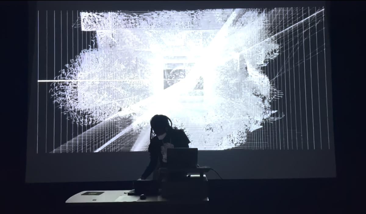
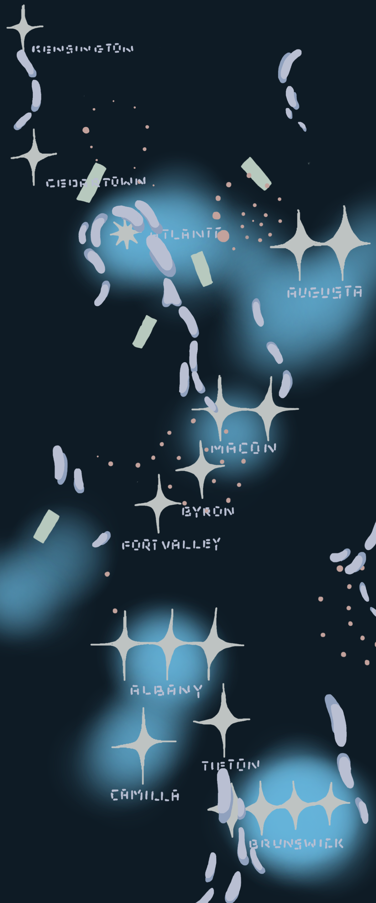
The Peach Pit is a geospatial data visualization that reveals the disproportionate amount of pollution affecting Black communities in the state of Georgia. This project aims to bring awareness to the environmentally racist practices institutions employ when choosing places to build factories and dump waste. The data used in this project shows a correlation between air, water, and soil quality and the amount of pollution present in Black neighborhoods.
For this project, I sorted through population and environmental databases in order to support the hypothesis that pollution disproportionately affects communities of color. Through my research, I discovered that accessing “accurate” data is very tricky because it is often partial or very expensive to obtain. Coming across this fact, I decided to embrace the nature of the data available to me and used existing maps provided by the U.S. Environmental Protection Agency (EPA) to plot points in the areas on the map containing the national percentile of each type of pollution.
While looking at the map data, I noticed in certain towns there were clusters of highly polluted areas, called Superfund sites. These sites are contaminated with toxic waste that is left out and improperly managed. Research shows that adverse health effects will most likely occur within a mile radius of a Superfund site (EPA, 2022). There are 17 active Superfund sites in Georgia and 12 of them are in cities with a majority Black population, which shows an inequality considering Georgia is a majority white populated state. All the cities and counties where Superfund sites are located have poverty rates above the national average (some counties are 2 or 3 times above the national average).
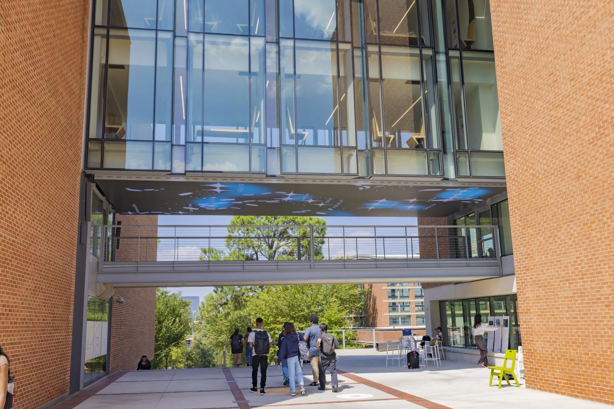
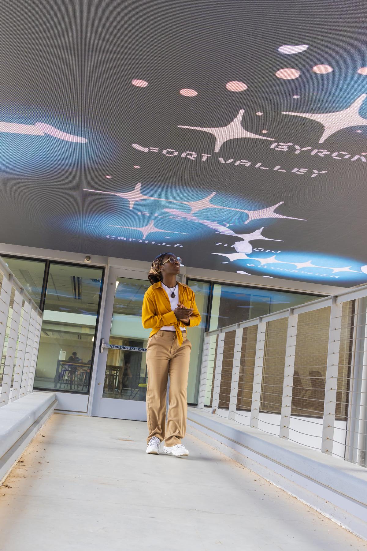
In hopes to raise awareness of the unfair realities of these communities, I created an animated work that provides a visual experience that takes into account the fluidity of data. The motion in this animation mimics nature and data’s fluid relationship with time, welcoming nature and data’s inconsistencies and evolution. This work utilizes imagined patterns of natural elements with geographical information of Georgia’s landscape. The aesthetic and patterns of nature and data are being experimented within a controlled environment on the Media Bridge here at Georgia Tech.
Invitation to Interact
Take time to follow the patterns and paths formed by each type of pollution represented in this animation. Do they fall alongside any landforms you know of in the area? What correlations are you able to find between the polluted areas and Georgia’s demographics?
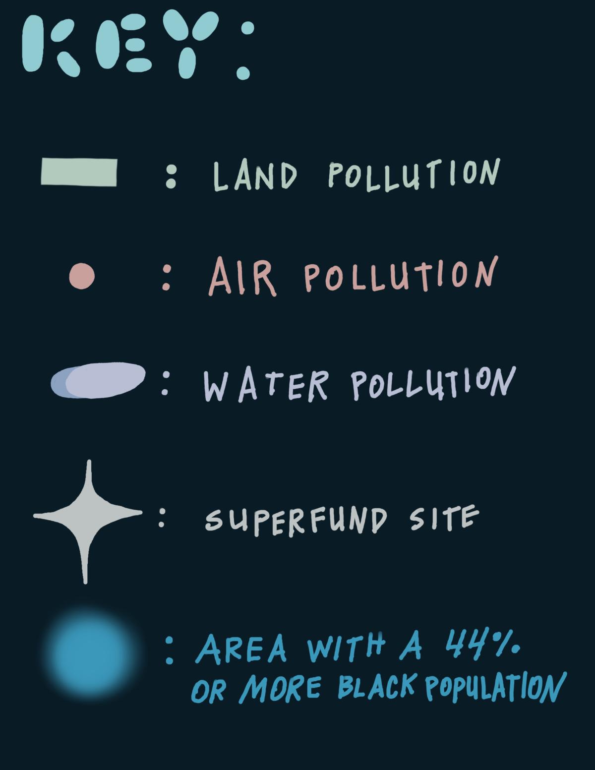
This legend shows what each symbol on this data visualization means. There are five symbols: a green rectangle (representing the land pollution), a brown circle (representing the air pollution), a blue oval (representing the water pollution), a gray star (representing superfund sites*), and a blue blob (representing Georgia’s Black population). The pollution data is collected from an EPA environmental justice database. The demographic data is from www.statisticalatlas.com.

Adira Griffin
Adira Griffin is an emerging new media artist and multidisciplinary designer based in Atlanta, GA. She recently graduated from the Savannah College of Art and Design and received a B.F.A. in Motion Media Design. She uses both digital and traditional media to convey her narratives. Griffin’s most recent projects include immersive experiences that examine emotive power and surreal environments.
In her work, she attempts to provide an alternative program to mainstream media’s adverse effect on human connection, communication, and psyche. In practice, her honest experiments create an uninterrupted, open space to explore memories, dreams, and societal happenings.

